Products · DMS · Reporting & dashboards

The Monday-morning numbers,
without the Sunday night.

Thirty-nine role-based dashboards and 200+ metrics — for bishops, archdeacons, DSAs, DAC secretaries, treasurers and administrators — plus a self-service builder so the next report doesn’t need a developer.

34
Role-based dashboards
172
Metrics out of the box
Self
Serve report builder
GIS
Maps on national boundaries
Three ways it helps

Three ways the reporting works for you.

Dashboards for the questions you ask every week, a builder for the ones you haven’t asked yet, and plain English for everything in between.

Role-based, out of the box.

A bishop, an archdeacon, a DSA and a treasurer each land on a dashboard built for their questions — 34 of them, backed by 200+ metrics, permission-aware from the first login.

Build your own, no developer.

A custom dashboard builder and a report & visualisation builder with drill-down, scheduled email delivery, threshold alerts, sharing permissions and version history. The backlog of “small report requests” disappears.

Ask in plain English.

Describe the report you want and the Data Explorer writes and validates the query — AI-assisted, permission-aware, and always showing its working. More on the AI assistant →

In the detail

From pivot tables to projections.

Everything exports — CSV, XLSX, PDF — and everything drills down to the record it came from, so a number is never the end of the conversation.

Mission Dashboard

Attendance, finance, clergy history, deprivation, viability and schools impact from archdeaconry down to parish — benchmarked against national statistics.

Pivot reports

Interactive pivot tables over returns and finance data, with saveable configurations your team can share.

Maps everywhere

GIS map views with comparison layers, on boundary data synced from the Church of England’s national ArcGIS layers.

Forecasting & scenarios

Ten-year projections with scenario sliders, the clergy retirement-wave model and planning goals drawn against trend. Full forecasting deep-dive →

Scheduled delivery & alerts

Reports that email themselves on schedule, and thresholds that raise a flag when a number crosses a line — instead of someone noticing in March.

One version of the truth

Every dashboard reads the same live records the teams work in — when two numbers disagree, the drill-down shows you why.

Seen in the product

What it looks like.

Live screens from the platform — the same views a diocesan team sees.

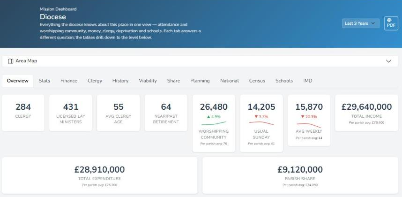
Mission dashboard overview with tabs and headline figures
The Mission DashboardOverview, stats, finance, clergy, history, viability, share, planning, national benchmarking, census, schools and deprivation — each a tab, each drilling from diocese to parish. Figures illustrative.
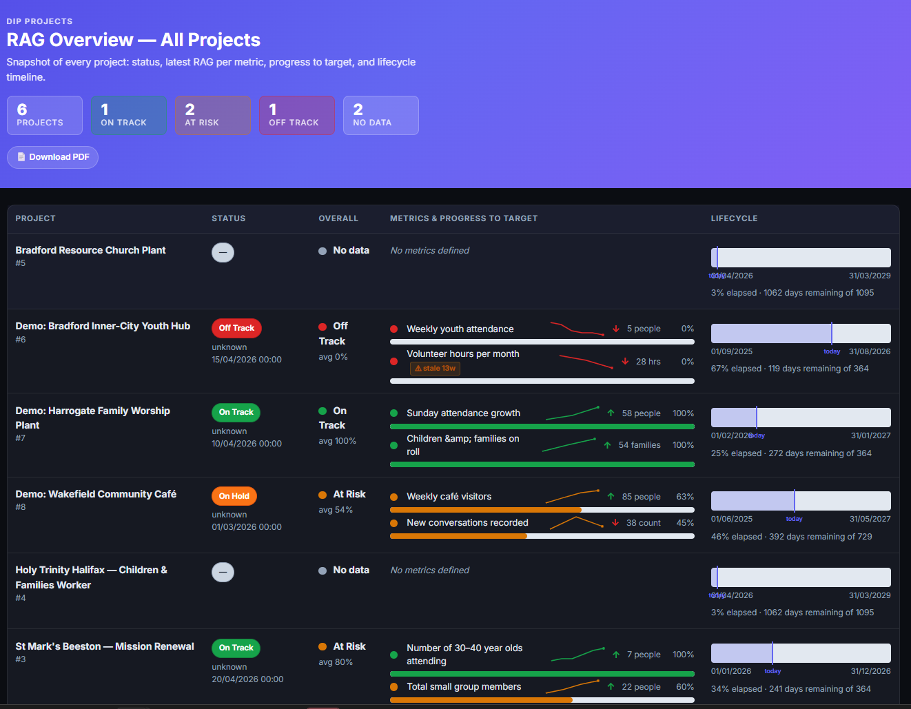
RAG project overview dashboard
RAG project overviewProgramme and project status at a glance, red/amber/green.
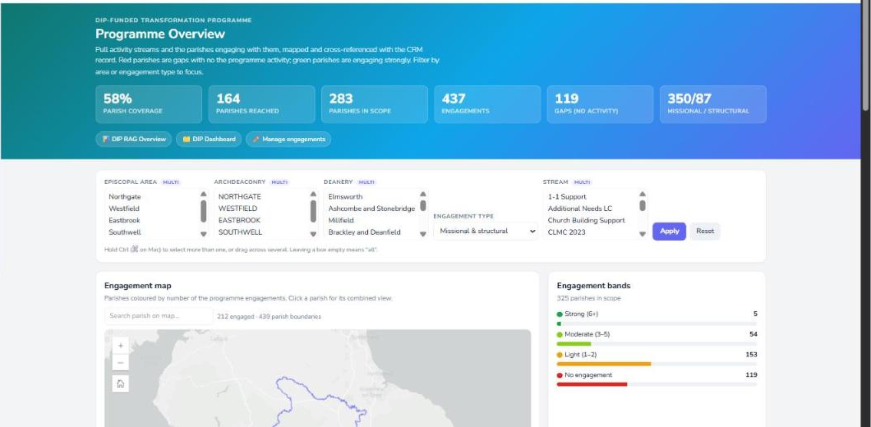
Programme overview with parish coverage and engagement bands
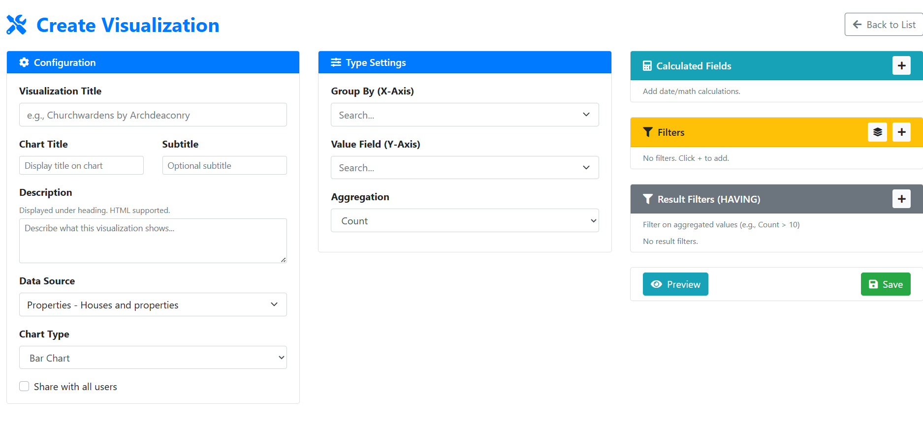
Visualisation builder configuring a chart from a data source
Building a chartPick a data source, a grouping and an aggregation — filters, calculated fields and a preview before you save. No SQL, no developer.
Programme coverageWhich parishes a funded programme has actually reached, and which are gaps — mapped and cross-referenced with the CRM record.
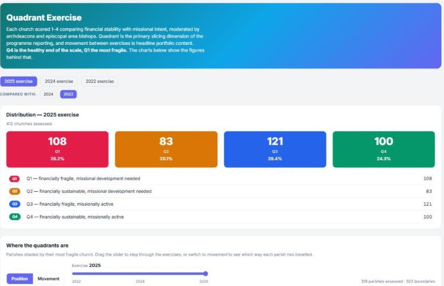
Quadrant distribution across the church estate
Quadrant distributionEvery church scored on financial stability against missional intent, with movement between exercises as the headline.
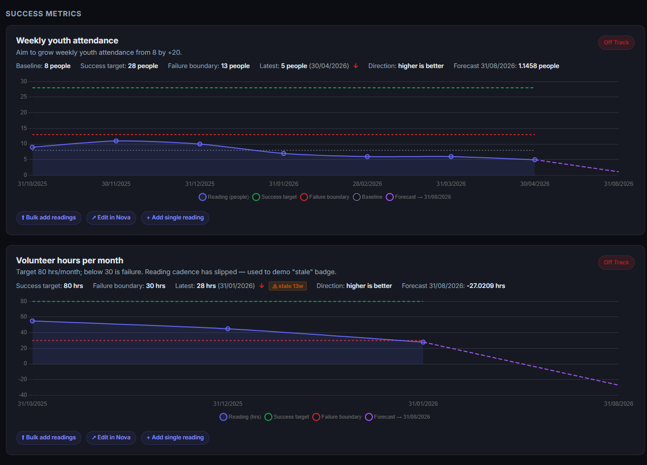
Success metrics with readings
Success metricsMetrics with readings and status history, exportable for funders.
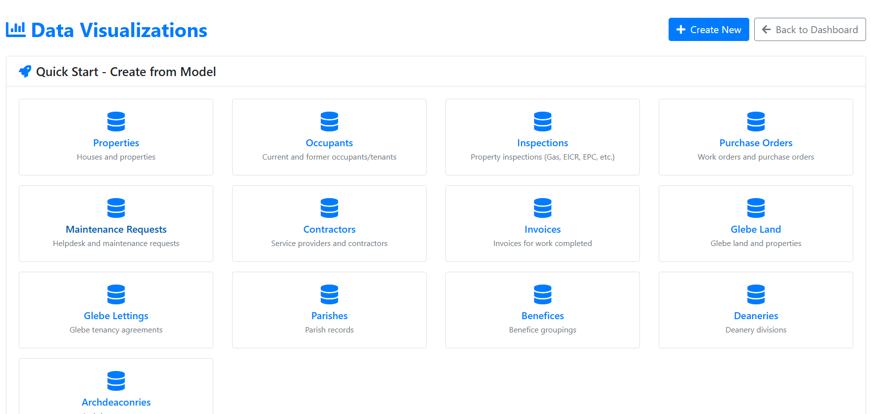
Data visualisation builder
Visualisation builderSelf-service charts with drill-down and sharing.
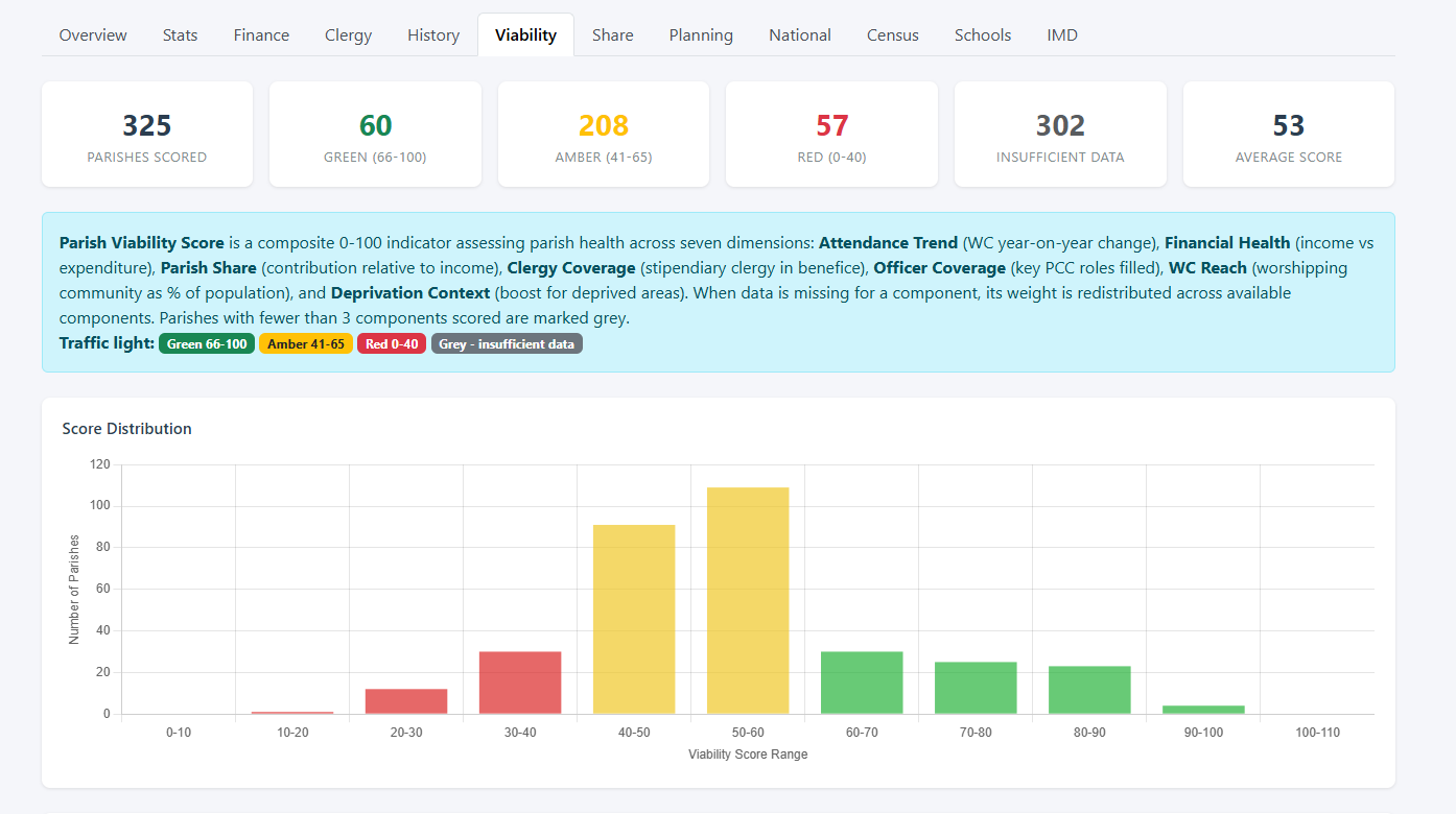
Parish viability score
Parish viabilityViability scoring blended from attendance, finance and demographics.
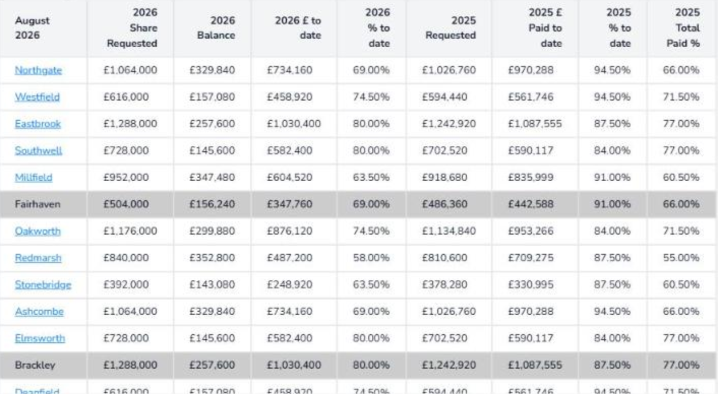
Parish share table
Parish ShareRequested vs received vs outstanding, drillable to parish level.
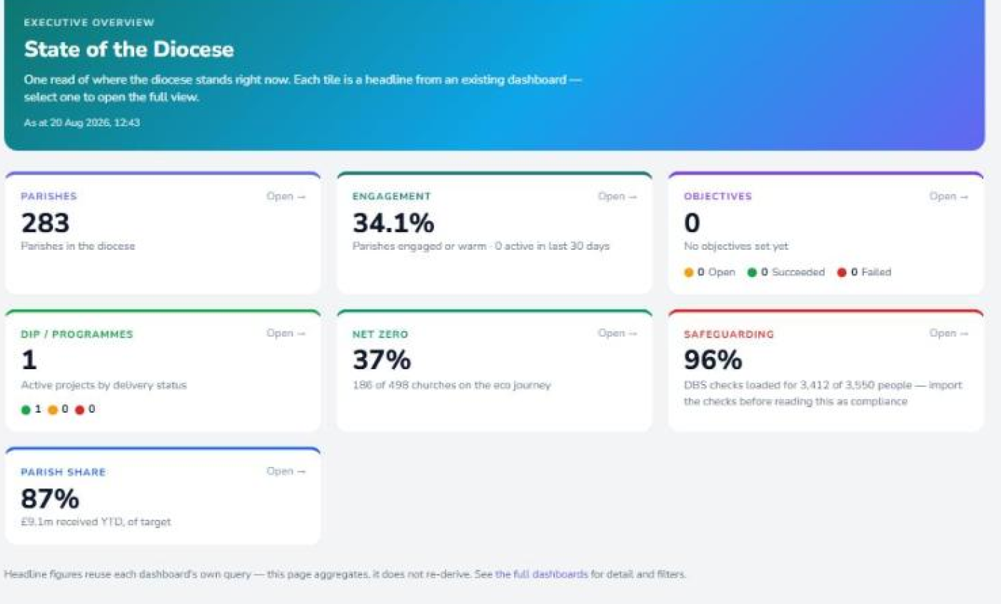
State of the Diocese executive overview tiles
State of the DioceseOne read across every domain, each tile reusing its own dashboard’s query rather than re-deriving the number.
Operations dashboard
Operations dashboardA team’s live workload in one view.
The mission dashboard

Every number about a place,
on one screen.

Attendance, money, clergy, deprivation and schools — for the diocese, an archdeaconry, a deanery, a benefice or a single parish. Each tab answers a different question, and every table drills down to the level below.

The planning map

Parishes on the boundary map, coloured by whatever the conversation is about — years to clergy retirement, share against ministry cost, attendance trend, attendance per stipendiary post. Click a parish for its churches, their listing status and their condition.

Viability scoring

The ratios a deployment board argues over, computed per place rather than assembled by hand: attendance per full-time-equivalent post, share required against ministry cost, and ministry cover across the parishes in a group. Workforce planning →

Schools reach

Church schools with their governance category, capacity and roll — and what proportion of the local school population the diocese is actually in contact with, which is a more useful question than how many schools it has.

Deprivation in context

The Indices of Multiple Deprivation attached to every parish, with the direction of the scale stated on screen: a lower rank means more deprived. That catches people out, and it should not be left to.

Comparison, not just totals

Each figure carries where it ranks among its peers and what share of the diocese or parent area it represents — so a number is read against something, rather than in isolation.

Methodology on the page

Where a diocese total legitimately exceeds the sum of the rows above it — cathedral, diocesan and chaplaincy posts belong to no archdeaconry — the page says so. Better than leaving somebody to find the discrepancy and distrust the rest.

Mission Dashboard

The same questions, asked at every level.

Diocese, archdeaconry, deanery, benefice and parish — always from the same underlying rows.

Trends, not snapshots

Statistics for Mission and finance series over a decade, so a hard year is distinguishable from a decline.

Like-for-like comparison

Comparison tables ranking places within their own level, with clergy and lay-ministry cover alongside, so cover and outcome are read together.

National benchmarking

Your position against national figures — the question a bishop’s council asks first, and the one a local system usually cannot answer.

Gaps stay gaps

2020 and 2021 carry no usual-Sunday figure because the return did not ask. They plot as a gap, never as zero — the difference between a chart that informs and one that alarms.

A dashboard is only honest if you can click the number and see which records made it. Everything here drills down.
— See also: Why dashboards lie · Three reports before Monday morning
Next step

Bring a real question.
We’ll answer it live.