Products · DMS · Funded programmes & project delivery

What the funder asked,
answered from the record.

Diocesan investment programmes — DIP, SDF, and whatever the next one is called — are reported on quarterly by people who did not do the work. DMS holds the programme, its projects, their plans and their measures in one place, so the return is assembled from what the diocese actually recorded rather than rebuilt from memory in the week before the board.

RAG
Portfolio on one screen
Weighted
Plan progress that can’t lie
Forecast
Every measure, to target date
2 clicks
Board pack to PDF
The shape of it

Programme, project, measure.

Three levels, each answering a different question — and each one the level somebody actually reports at.

Programmes hold the money.

The funded programme is the unit the national body granted against. It carries its projects, its overall shape and its reporting cycle — and it is the level a highlight report is written at.

Projects hold the work.

Each project has a lifecycle, a plan, a set of measures and the people tagged to it. Two delivery patterns are supported side by side: places the diocese invests into, and diocese-wide activity parishes opt onto.

Measures hold the truth.

A measure is not a status field somebody types. It is a baseline, a success target, a failure boundary and a series of dated readings — so “on track” is computed, not asserted.

The planner

A plan that can’t report progress the work doesn’t support.

Most project tracking in a diocese is a spreadsheet where the percentage is whatever the last person typed. This one derives it.

Tasks, summaries & milestones

A real work breakdown — parent tasks with children beneath them, milestones, estimates, owners and dates. Not a flat list pretending to be a plan.

Weighted roll-up

A summary task works out its own percentage from the tasks beneath it, weighted by size. A plan cannot show 80% complete because the small jobs got done and the big one didn’t start.

Dependencies

Link a task to what it waits on, and see the chain. The thing that slips is rarely the thing that misses its date — it’s the thing three links upstream.

Tasks linked to goals

A task can point at the measure it is meant to move, so the plan and the outcome are connected rather than filed separately.

Lifecycle, elapsed vs remaining

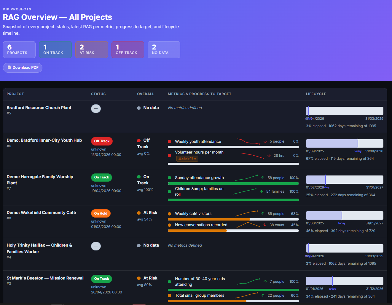
Every project shows how much of its funded life has gone against how much is left — the single most sobering number on the portfolio screen.

Job roles tagged to projects

Posts can be tagged to the project they belong to. Note this is a tag, not a funding trail — how a post is paid for is a separate chain. See the establishment register →

Measures & assurance

“On track” should be a calculation.

A RAG rating that somebody set by hand three months ago is worse than none, because it looks current.

Baseline, target, failure boundary

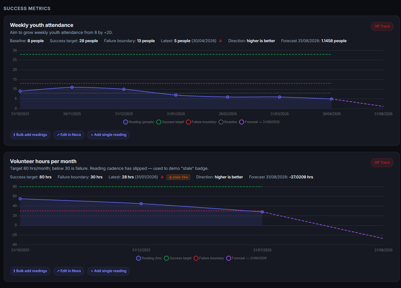
Each measure declares where it started, what success looks like and the line below which it has failed — agreed once, at the start, rather than argued about at the end.

Readings over time

Dated readings build the series, added singly or in bulk. Direction is declared per measure, because for some of them down is the good news.

Forecast to target date

The trend is projected to the measure’s own end date, so a project that is technically on target but heading the wrong way shows as what it is.

Stale readings are flagged

A measure nobody has updated for months carries a stale badge. Silence stops reading as good news — the failure mode of every RAG report ever written.

No data is not green

Projects with no measures defined report as “no data”, never as on track. An unmeasured project and a healthy one must never look the same.

Board packs & highlight reports

The portfolio view exports to PDF for the board paper, assembled from the live record rather than retyped into a template.

Engagement

Programme work is engagement work.

The distinction that catches every new user out, designed around rather than trained around.

Logged against the parish

An engagement belongs to the parish that engaged — it sits on their record and counts in their engagement history. The project still sees it, because its activity tab pulls in everything that names it. Recorded the other way round, the parish’s own timeline stays empty.

Quick Log

One screen to record a visit, call, meeting or piece of support in under a minute — who, what, how long, and which programme stream it belongs to. See the engagement timeline →

Opened with the context filled in

Every programme and project carries buttons that open Quick Log with the right subject already selected, so the common mistake is hard to make rather than merely documented.

Notional weighting, in hours

Streams can carry notional hours of diocesan time and parish time, so a programme can be costed by what it consumes rather than scored out of five.

Two lines, never blended

Diocesan staff time and parish volunteer time are reported separately. Added together they produce a number that invites the question “so where is that money?”.

Unweighted is never zero

A stream nobody has weighted yet reports as unweighted. Showing it at zero next to real ones ranks it bottom of every chart and gets the whole model distrusted early.

What it looks like

On screen.

The portfolio, a measure with its forecast, and the programme overview.

Project plan task list beside a Gantt chart
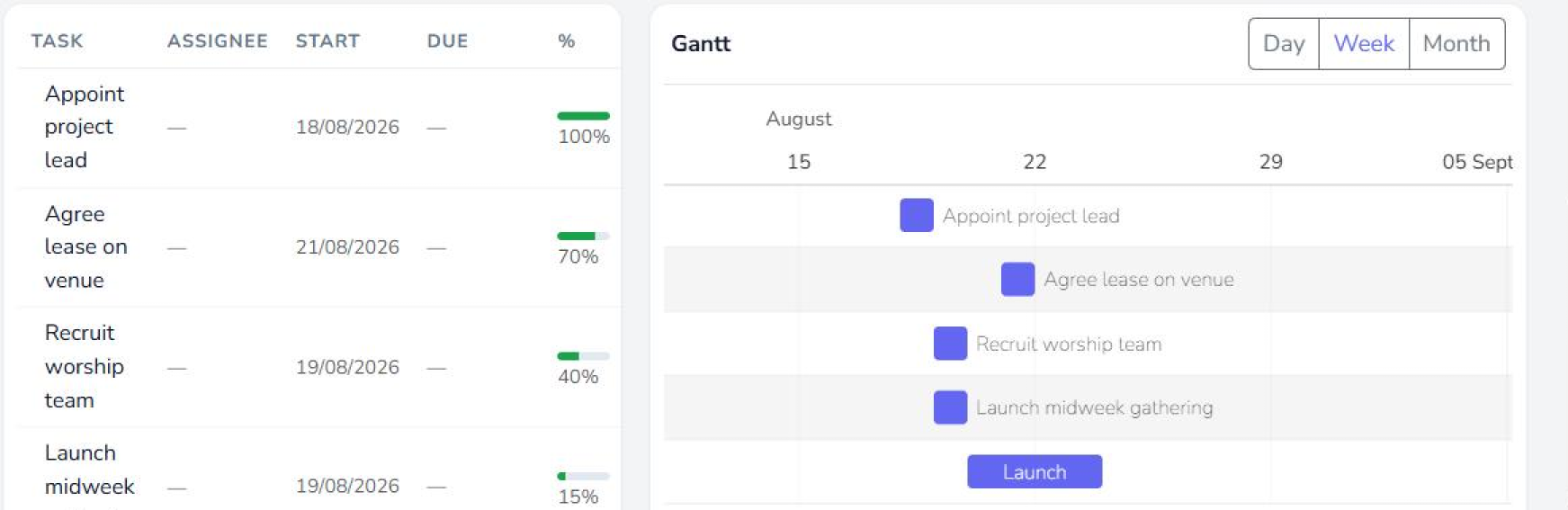
The plan itselfTasks with owners, dates and percentage complete on the left; the same work as a Gantt on the right, switchable between day, week and month. Summary tasks derive their percentage from the work beneath them, weighted by size.
RAG overview of all programme projects with status, metrics and lifecycle
The portfolioEvery project with its status, latest RAG per measure, progress to target and how much of its funded life has gone.
Success measure with baseline, target, failure boundary and forecast
A measure in fullBaseline, success target, failure boundary, readings and the forecast to target date — with a stale badge when the readings stop.
Programme overview with per-parish engagement
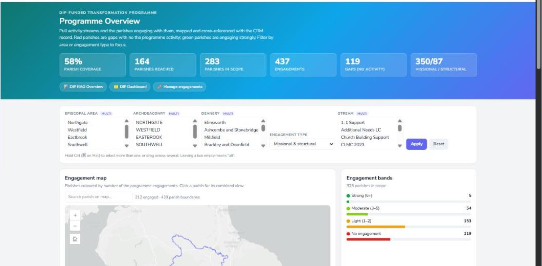
Programme overviewThe rollup across the programme, and the same picture per parish underneath it.
Quadrant view of engagement against viability
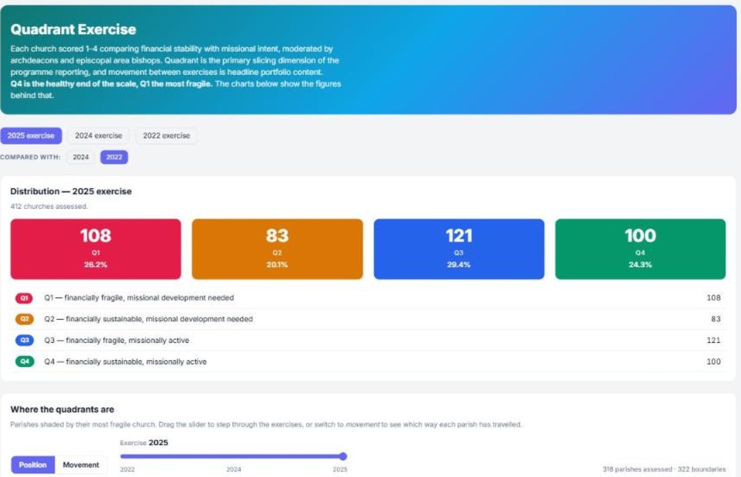
QuadrantsEngagement against viability, by episcopal area and by deanery — where the investment is going versus where the need is.
Project communications and activity
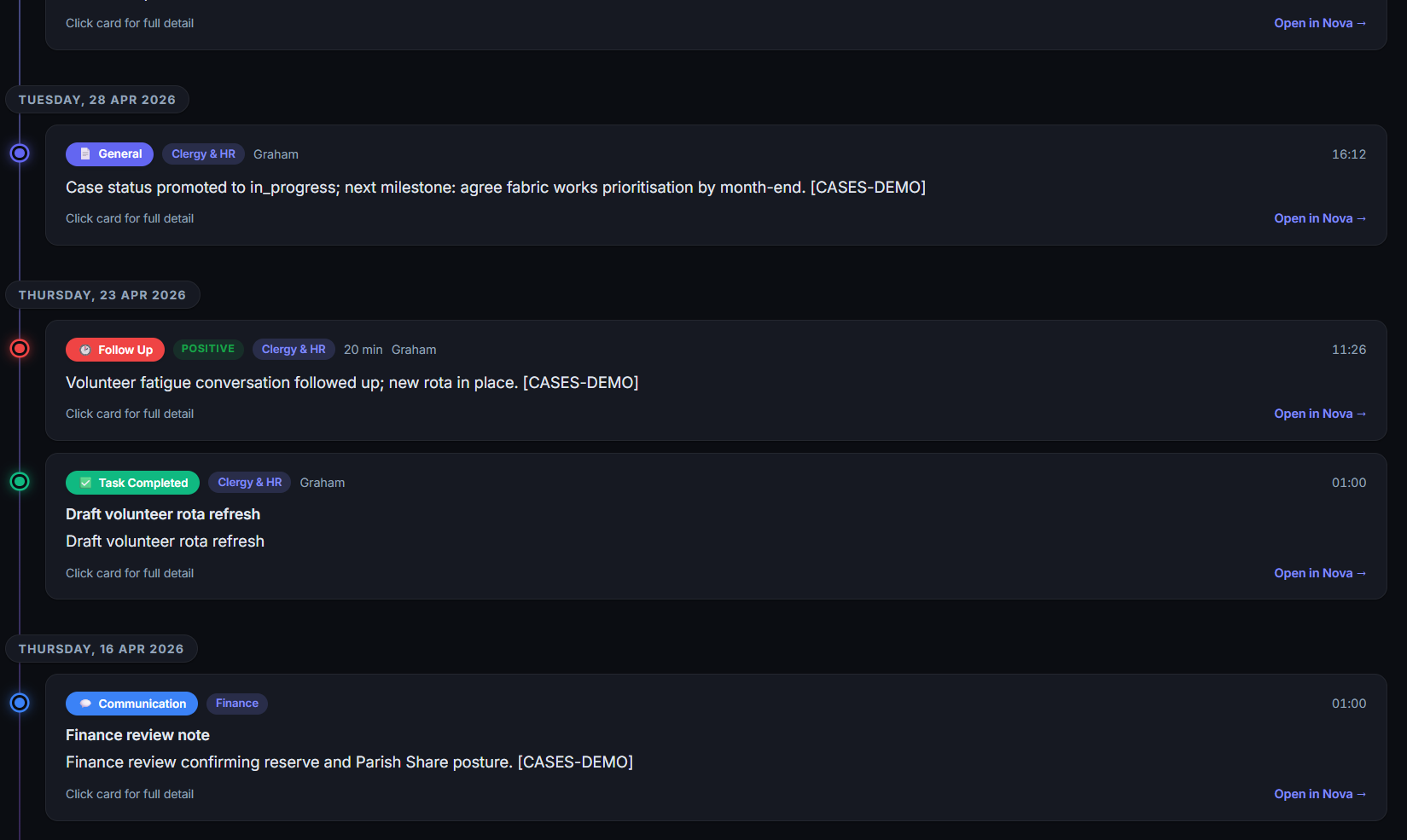
Activity on a projectEverything logged against the project, including engagements recorded on the parishes it works with.
Engagement search filtered by activity type and team
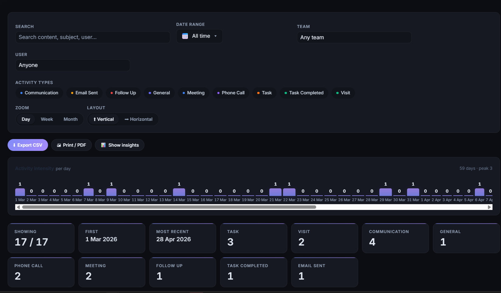
Search the recordEvery engagement across teams, filtered by type, team, person and date — exportable, with the intensity over time above it.
Where the numbers come from

Reported against real data, not just its own.

A programme return is more convincing when the denominator comes from somewhere the funder already trusts.

The national contact system

People, posts and places sync from the Church’s own Contact Management System, so the programme reports against the same register everyone else uses. See integrations →

Statistics for Mission

Attendance, electoral roll and the annual return series — the measures a viability judgement actually rests on.

Census & deprivation

Population and IMD by parish, so “where the need is” is evidenced rather than assumed.

Mapping & boundaries

Parish and church geography from ArcGIS, driving the map views and the area rollups.

The quarterly return was never hard because the work was hard. It was hard because nobody had written down what happened until the week it was due.
— Why programme reporting belongs on the same record as the engagement
Next step

See it with your own
programme in it.