Products · DMS · Forecasting & scenario planning

See the retirement wave
before it breaks.

Ten-year projections over attendance, finance, clergy supply and school places — built from your own published history, with sliders for the assumptions and goal lines for where synod wants to be. Every line is reproducible arithmetic a board can interrogate.

10yr
Projection horizon, adjustable
4
Domains modelled together
Goals
Targets drawn against trend
0
Black boxes — it’s arithmetic
Three questions it answers

The three questions every diocesan strategy day circles.

Where are we heading? Where do we want to be? And what would have to change to close the gap?

Where are we heading?

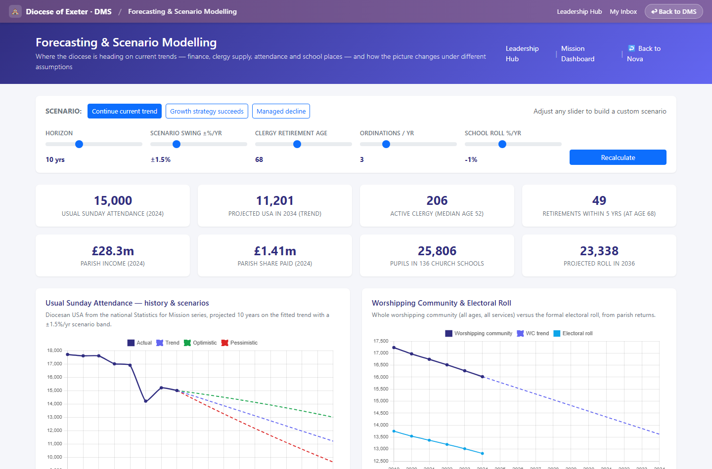
Trend fits over your own history — the national Statistics for Mission and Finance series plus your parish returns — project attendance, income, parish share and school rolls forward with an optimistic/pessimistic band. Series breaks and COVID years are handled honestly, and the fit quality is shown, not hidden.

What about the clergy?

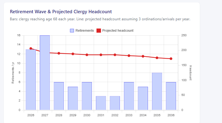
A cohort-ageing model: every member of clergy, their age band, and the year they reach the retirement age you choose. Drag the sliders — retirement age, ordinations per year — and watch projected headcount recalculate against the wave. The age-profile chart is the retirement wave in waiting.

Where do we want to be?

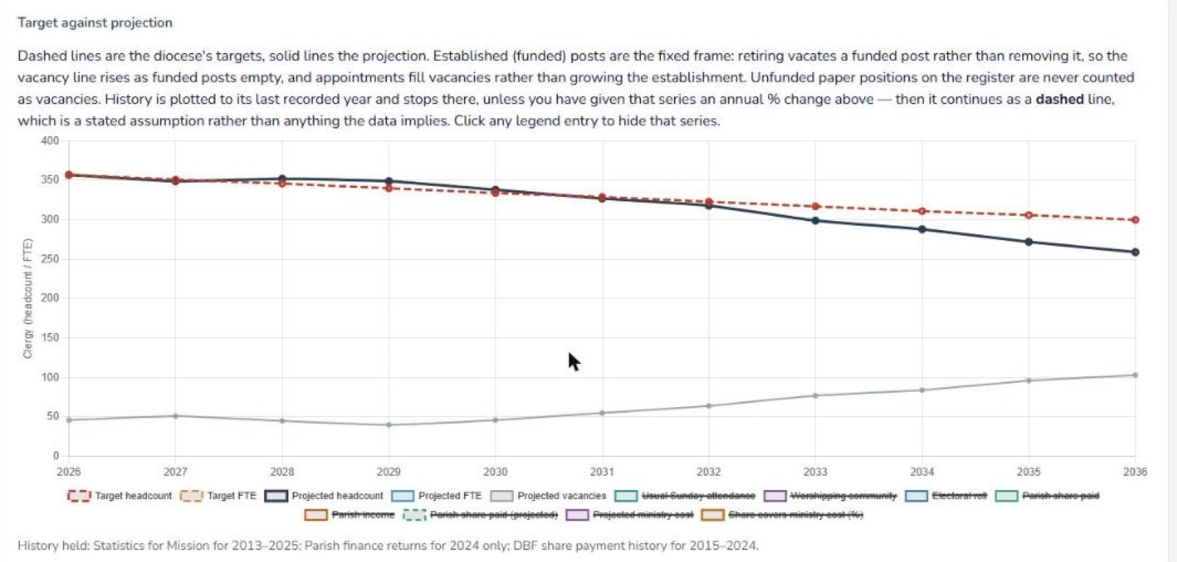
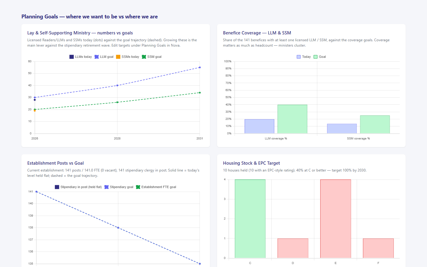
Planning goals — stipendiary posts, Reader/LLM and SSM numbers and benefice coverage, housing EPC targets, ordinations — entered per target year and drawn as dashed lines against the actuals. The gap between the lines is the strategy conversation, on one screen.

In the detail

Assumptions on sliders, not in appendices.

Scenario presets for the meeting — continue current trend, growth strategy succeeds, managed decline — and custom sliders for everything else.

Attendance & community

Usual Sunday attendance, worshipping community and electoral roll — history from 2009 where published, projected under the scenario band.

Finance & parish share

Income vs expenditure with the projection band — where the pessimistic line crosses expenditure is the affordability cliff — plus the share trend that funds stipendiary ministry.

Clergy supply

Retirement wave by year, projected headcount under your ordination assumptions, and the age-band profile that drives it all.

Lay ministry coverage

Readers/LLMs and SSMs tracked by headcount and by benefice coverage — because ministers cluster, and coverage is what parishes feel.

Deployment pressure

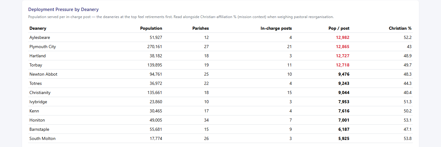
Population served per in-charge post, by deanery, alongside Census religious-affiliation context — the deaneries at the top feel retirements first.

School places

Church-school pupil rolls with an assumption-driven projection you calibrate to your local authority’s place forecasts.

Housing & EPC targets

Parsonage stock against the EPC-C trajectory — the practical edge of the 2030 net-zero commitment. More on Net Zero →

Data-quality scorecard

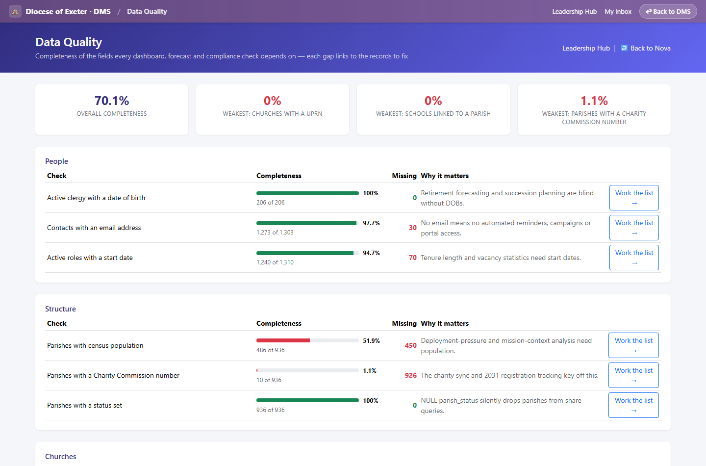
Forecasts are only as good as the data — a companion page scores completeness (dates of birth, UPRNs, links) with a work-queue link for every gap.

Explainable by design

Least-squares trends, cohort ageing and stated assumptions — no AI in the numbers, every line reproducible, fit quality (R²) printed on the page.

Where investment should go

The quadrant exercise.

Projections tell you what happens if nothing changes. The quadrant exercise is how a diocese decides where to change it — and it is deliberately a judgement, moderated by people, not a score a machine assigns.

Two axes, four positions

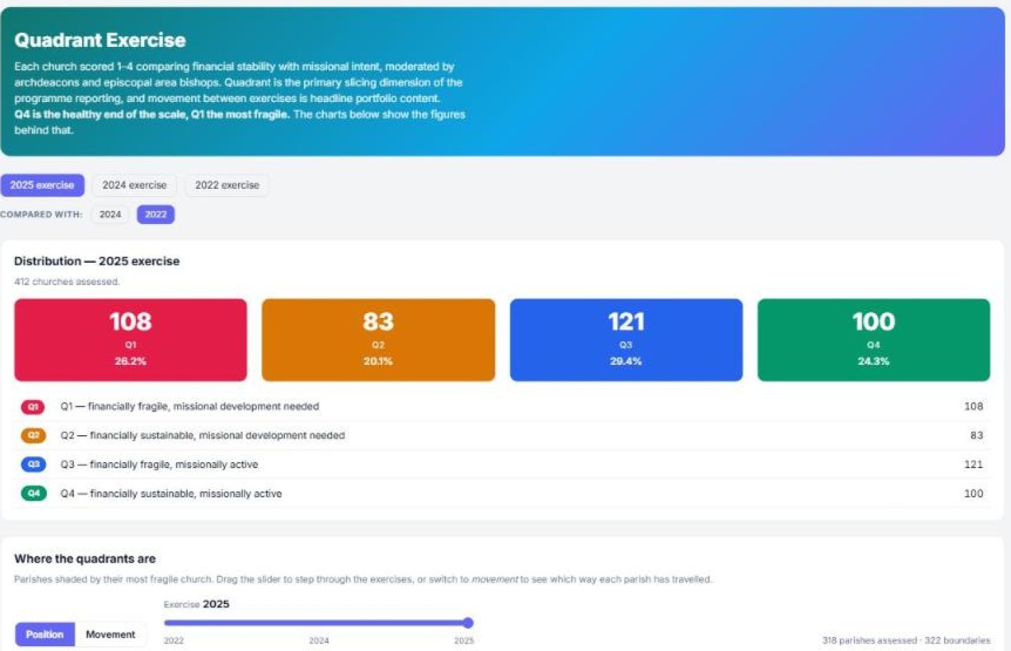
Every church placed on financial sustainability against missional activity. Q1 financially fragile and needing missional development · Q2 financially sustainable, missional development needed · Q3 financially fragile but missionally active · Q4 sustainable and active — the healthy end of the scale.

Moderated, not calculated

Scores are set by archdeacons and area bishops who know the places, then moderated across areas for consistency. The platform holds the exercise, the reasoning and the moderation — it does not pretend to produce the judgement.

Movement is the headline

A single year’s distribution is a snapshot. What a programme board actually needs is which churches moved between exercises and in which direction — so successive exercises are held together and compared rather than replacing one another.

Gaps stay visible as gaps

A church not assessed in an exercise reads as unassessed, never as a low score. On the map that is grey — a gap in the data, not a confirmed position — because quietly scoring an absence would defeat the whole exercise.

It feeds the deployment argument

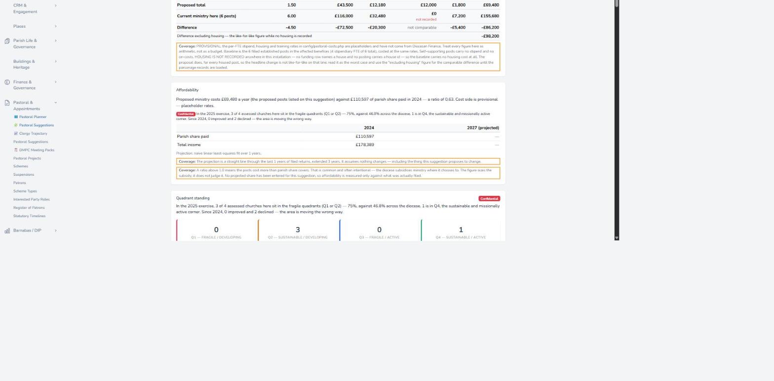
Proposed reorganisations carry the quadrant standing of the churches involved alongside the affordability figures, so a decision that looks affordable on paper can still be questioned on fragility. Workforce planning →

Programme reporting, joined up

Quadrant position slices the funded-programme reporting, connecting where investment went with where the need was assessed to be. Reporting & dashboards →

Quadrant distribution across the church estate
Quadrant distributionEvery assessed church across the four positions, with movement between exercises alongside.
Affordability with quadrant standing
Affordability, in contextMinistry cost against projected share — with the quadrant standing behind the judgement.
Seen in the product

What it looks like.

Live screens from a demo diocese built entirely from published national data — real structure and real statistics, generated people.

Forecasting page with scenario sliders and projections
Scenario modellingPresets and sliders — horizon, swing, retirement age, ordinations — over live projections.
Clergy workforce trajectory chart, target against projection
Workforce trajectoryTarget against projection, with the vacancy line and the church-life series overlaid. Every assumption sits on the same screen and is editable. Workforce planning →
Retirement wave and projected clergy headcount chart
The retirement waveClergy reaching retirement each year against projected headcount.
Planning goals versus actuals charts
Goals vs actualsMinistry numbers, benefice coverage, establishment posts and EPC targets against their trajectories.
Deployment pressure by deanery table
Deployment pressurePopulation per in-charge post by deanery, with mission context.
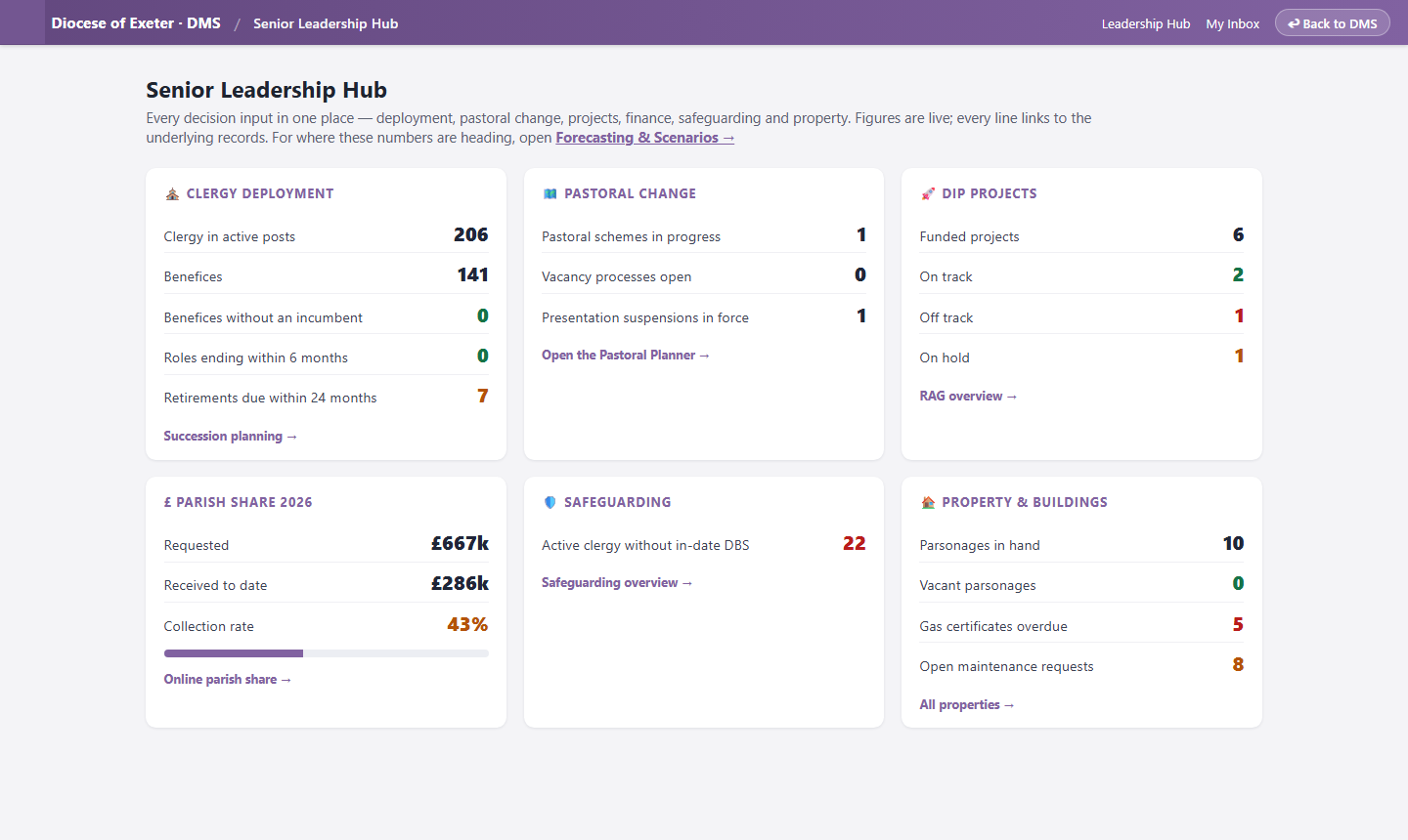
Senior leadership hub with live figures
Leadership HubEvery decision input live on one page, each line linking to its records.
Data quality scorecard
Data qualityCompleteness scoring with a work queue for every gap the models depend on.
A projection you can’t interrogate is a slide. A projection with the assumptions on sliders is a strategy meeting.
— See also: Pastoral planning · Reporting & dashboards
Next step

Bring your last strategy paper.
We’ll put it on sliders.